60 minutes


Screened as part of NZIFF 2003
Re Creation: Films by Robert Breer
“Hurray for a formless film, a non-literary, non-musical, picture film that doesn’t tell a story, become an abstract dance, or deliver a message. A film with no escape from the pictures. A film where words are pictures or sound and skip around the way thoughts do. An experience itself like eating, looking, running, like an object, a tree, buildings, drips, and crashes. A film that, instead of making sense, is sense” — Robert Breer (1962)
In 1949 armed with a recently awarded degree in painting from Stanford, the young American artist Robert Breer arrived in Paris. Since then, Breer has produced significant bodies of work in sculpture, painting and film. Although Breer’s filmography contains more than 40 animated and avante garde works, Breer himself says he “backed into filmmaking”.
Soon after his arrival in Paris, he exhibited some of his early paintings in a group show called Le Mouvement, sharing the bill with artists such as Marcel Duchamp and Victor Vasarely. Considered by many to be the first show devoted exclusively to kinetic art, it sparked the creation of its own manifesto – The Yellow Manifesto
It also sparked in Breer an obsession to explore the earliest principles of the moving image – and for Breer this meant reinventing the meaning of the humble flipbook and the Mutascope, a hand-cranked version of a flipbook. A series of exhibitions in France and USA featuring collections of these creations served to present these items not as curiosities or children’s toys but as kinetic sculptures. In one exhibition he even co-opted a collection of desktop rolodexes to further develop this point.
Breer was transfixed with the way the images seemed to ‘float’ in mid air and by the unpredictable speed and stability with which they played out before his eyes. He set out to attempt to capture these random , variable elements on the highly regimented, stable platform of mechanically projected film. This original inspiration has fuelled most of his films and is the basis for their originality and uniqueness. Other Breer hallmarks can be seen across this collection of his films, in particular his general avoidance of primary colours and a reluctance to draw many straight lines. These films are a tribute to an original eye and mind uncowed by random movement. — Malcolm Turner
Recreation 1956
An initial, but short-lived, silence heightens the visual impact of this rapid-fire shoot-out of text vs. object collages. Some images have but a few frames in which to grab the viewers attention – the impression often left is that of remnants floating in the frame.
A Man and His Dog Out for Air 1957
A film cleverly challenges its own basis – at what point does a stretched dot become a line; at what point does that line become a curve; when does the curve become a shape – and when does the shape become a man and his dog out for air?
Blazes 1961
An astonishing achievement. Breer introduced this film as ‘100 basic images switching positions for 4000 frames – a continuous explosion’. Each single frame represents one of 100 index cards, which were filmed, shuffled and filmed again 40 times.
69 1968
Part of a trilogy (which also included 66 and 70), this film brought Breer’s prowess with solid, drawn geometric shapes to the fore. Repeated visual references – in the beginning – arm the viewer with something of an index with which to begin decoding the filmmaker’s intentions, only to have imagery from A Man and His Dog Out for Air return and begin exerting enough pressure on these shapes to metamorphise them into human forms.
Fuji 1974
The simple, elegant lined geometry of Mt Fuji provides the inspiration and backdrop for Breer to perform one of his most successful experiments with rotoscoping – a technique which allows an animator to draw over ‘live action’ footage. Breer’s trademarks are all here – the apparently floating imagery, the rapid succession of varied and oddly juxtaposed objects, the initially familiar lines morphing into new imagery – but this film introduces a sense of distance, wide-angle shots and longer depths of field than have been seen in his previous films.
LMNO 1978
An intensely colourful film, LMNO relies more heavily on a recurring, central character (a crudely crayon-drawn policeman) for much of its delivery than Breer’s previous films. Inherent, too, in the DNA of this film are references to screen culture and to the very mechanical nature of the way films are projected. A scene featuring a locomotive careering towards the screen is all too reminiscent of the earliest Lumière footage which frightened audiences so much. Other shots are carefully crafted to make them almost impossible to see unless viewed as individual frames – a deliberate ploy which allowed the filmmaker to screen close-ups of phallic images without attracting the censor’s scissors.
Swiss Army Knife with Rats and Pigeons 1980
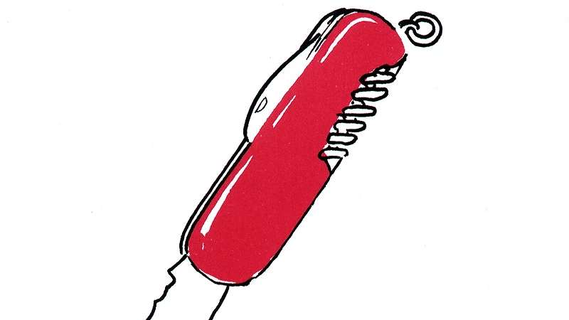
Utilising an apparently new-found obsession with the colour red and reinvigorating some of the circular imagery of A Man and His Dog Out for Air and 69, Breer delves into the very basis of animation to explore how a variety of easily recognisable objects can be portrayed and manipulated differently using pixillation and classically drawn animation.
Bang! 1986
Breer’s interest in moving image gadgets brings a thaumatrope to the screen in this film. Fortunately, Bang! ends with a brief visual explanation of the workings of this machine. Links between the innocent war games of children and the devastating war games of adults carry the age-old message that continues to elude mankind. Much of this is told using drawings that Breer created as a child and home-movie footage of the filmmaker as a young boy.
Time Flies 1997
A visual paradox, this film uses a collection of stills to portray a rapid movement of time. The introduction of pauses and black frames in this film not only – unusually – provides brief respite for the viewer to stop and think , but also insinuates the reduced snippets and shards of information that we increasingly take on in our headlong rush through the days.
ATOZ 2000
‘Deceptively simple, ATOZ flies through the alphabet, following each letter with a brief burst of animation or photographic images. Ecstatically beautiful, these minimovies use rapid changes in color and shape and edit together colliding representations of an object to create after-images and illusions of depth, rivaling anything Breer has done in his 50 years of filmmaking.’ — Fred Camper, Chicago Reader